Thursday, September 27, 2012

Play Date Cafe Challenge #151

Can you believe another week has passed? And it's almost October! This fall semester is just flying by.  Here's this week's color story:


Our sponsor this week is the fabulous EAD Designs.


Well, in honor of autumn being now upon us, I created a little altered mint tin...it's pretty autumn-y on the outside and spooky Halloweenie on the inside! This is my very first altered tin, so it was a learning experience for me. I mostly like the end result, but there are a few things I would do differently next time!


I used this fun sticker set sent to me from EAD:

So make sure to check out the challenge this week at The Play Date Cafe! Go to the blog for challenge and prize information!

Friday, September 21, 2012

Pumpkins and Cider!

So I absolutely love Christy Tomlinson's style. I have taken most of her workshops so far, and she announced a new holiday set a few weeks ago--one for fall/Halloween and one for Christmas. Well, I wasn't going to take the Halloween one, but all of the previews made it look just adorable! I have been feeling down on myself with my art and digiscrap lately, and I know that every time I've taken one of Christy's classes, I end up inspired.

So, I signed up and jumped right in! My first creation was this Halloween card (although I borrowed some ideas from Wild Abandonment, too):


 Then I sketched a bunch of ideas (more will turn into canvases soon enough, hopefully). I picked this one out because I thought it was super-fun, and here was my result:


I am so proud of the result! The tulle skirt was really annoying to mod podge down, but eventually it dried and now it looks totally cute!

I think "A" stands for "Amazing!" :) It was a leftover alpha sticker I had, so I didn't really have a choice in the letter, hah.

I am so excited by the ideas in my head lately, and I hope to be creating a lot more in the future, so stay tuned!

Thursday, September 20, 2012

Play Date Cafe Challenge #150

Hello! This week's colors at The Play Date Cafe are so bold and dramatic!

This week, our challenge is sponsored by The Alley Ways stamps, who generously gave us all stamps to play with!

I got this set, perfect for adding texture to my art journal background:


I thought the bright pink in the palette was very dramatic, so I made this art journal page:

I saw this quote on Pinterest, and I think that it's something a lot of us can agree on. Even though we all have our own ideas of what love is and how to show it, I think we can agree that hate, discrimination, incendiary remarks, etc, get us nowhere.

Supplies this week--in addition to The Alley Way stamps above, I used a few crafter's workshop stencils (flowers), a few game board stencils (big pink circles), my brand-new Big Shot and tattered flowers die (for the dimensional flower). I used Mister Huey's spray mist (the pink) and some Distress ink (for the brown edges). The chevrons were stamps with Staz-on inkpad.

Please check out The Play Date Cafe for challenge and prize information!

Sunday, September 16, 2012

Paper Haus Design Team!


So lately I have really been trying to go outside of my comfort zone, and when I saw that this brand-new online magazine blog was having a design call, I decided to apply! I was especially excited to hear that they are digi-scrap-friendly, too.

Yesterday, I found out that I made their team! This is exactly the type of thing I have been wanting to do for awhile, and I can already feel my scrap mojo coming back to me.

You can check out The Paper Haus here, and the big team announcement here. This is going to mean a lot more posts and projects from me, so keep an eye out, starting in October, for lots more fun!

Thursday, September 13, 2012

Play Date Cafe Challenge 149

I am SO excited to bring you this week's challenge, for several reasons!

First, I absolutely love these colors. Purple's my favorite, and I love to see purple and green mixed together. Add in the tangerine and it is just pure perfection!

Second, I just love the way my project turned out. It was my first big project using my brand-new Big Shot by Sizzix! I used the awesome Tattered flowers die by Tim Holtz, and a few embossing folders as well.


I have been resisting getting a Big Shot for quite awhile, but what finally got me to get one (other than a big sale at JoAnn's) was the realization that I love flowers. I also hate "using up" my supplies (and this is a big reason I love digital scrapbooking so much, actually) but it occurred to me that with a diecut machine, I could just keep making more and more, in any color I wanted. So, I got one, and I am so happy that I did!

Supplies:
8.5x11in canvas
the usuals-acrylic paint, gesso, SEI Tumble Dye, Mister Huey sprays, mod podge, punchinella, vintage plastic doilies, alphabet stencil, plastic canvas (as a stencil), Crafter's Workshop flower stencil, book paper
other-Big Shot Tattered Florals die, Dots embossing folder, metal brads, heart button, some patterned paper by ??, ribbon from a garage sale

I also have to credit Revlie for the "hope" lettering style. Check out her blog, she is a true artist!

As you might be able to tell, this is a companion piece to a smaller canvas (Happy) I posted the other day. They go quite well together!

So, are you inspired yet? I hope so! Please visit The Play Date Cafe blog for complete challenge information!  And, check out this week's amazing sponsor! Yup, you can win a gift certificate to the amazing Simon Says Stamp!

Simon Says Stamp

Monday, September 10, 2012

Happy

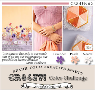
So things have finally started to calm down a little in my life, and even though I am still working long hours, I finally have found some extra time to art, just for me. I saw these colors over at CR84FN Challenge 62 and I just knew I had to play along! Purple is my favorite, and I just love how it combines with the peach.


Here's my take:


I included the math flashcard to represent that one of the things of beauty in my life is math! I know it's crazy, but math really is beautiful to me. The paint chips represent art, which of course is beautiful too!
So, supplies used include...
The usuals: gesso, acrylic paint, modeling paste, sei tumble dye, Mister Huey ink spray, punchinella
other: recycled stencils (the big circle one is plastic canvas, and the modeling paste circles were made using the negative cardboard from board game pieces), paint chips from the hardware store, paper flowers, a flashcard, the tag from an item I bought at a craft fair the other day!
stamps: alpha from Making Memories, faith/hope/love stamp from Studio 113 I think, and script stamp from Uptown rubber stamps


I got the quote sort of from this, except that I changed it to 1st person to avoid sounding preachy, I guess.


Also, I have to credit Revlie because I have seen many of her gorgeous works with words cut out like I have done with "happy" and I love how it looks on her projects. For example, check out this adorable canvas (linked to her blog post):


Make sure to stop back on Thursday, because I will be posting one of my favorite projects I've ever made!

Thursday, September 6, 2012

Play Date Cafe Challenge 148

It's time for a new Play Date Cafe challenge! I love the colors this week, and we have an amazing sponsor!


Here's our amazing sponsor...her stamps are so fun and versatile!

Lately I have been feeling overwhelmed and worn out by a number of "real life" things. As I was making this art journal page and wondering what text to add, these words just came to me. I have a Savior who has freed me from worry and anxiety.


Supplies used are basics...gesso, acrylic paint, masking tape, book paper, punchinella, paper flowers, and a few stamps, including a flower one from Inkadinkadoo, alpha from ImageTree, and a script one from LeBlanche. 

Thanks for looking! For more details, for prize information, and to participate in the challenge, visit The Play Date Cafe Blog!


Tuesday, September 4, 2012

Digital Art Journaling - Overwhelmed


There's still a little bit of time left to play along in this week's challenge at The Play Date Cafe!

 
 I wanted to share with you a digital layout/ art journal page that uses this gorgeous color scheme! I know that the journaling is hard to read, and I kinda did that on purpose...it basically talks about how I have been feeling overwhelmed lately with our recent move, and the start of the school year, etc. I am slowly beginning to recover and feel less stressed, though.